

New article
Recently updated
Using the navigational pane

Who is this article for?
Users who need help navigating the system.
No special access or permissions are required.
The navigational pane provides centralised access to core functionality through a clean, intuitive interface located on the left-hand side of the screen.
Understanding the navigational pane
The navigational pane houses several icons grouped to reduce visible items, provide a logical business process flow, and allow customisation to your requirements. The navigation menus are dynamic and depend on your permissions and screen context.
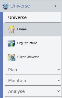
When starting the application for the first time, you will see a grouped Universe pane showing just the Home item. By default, it operates in Auto Expand mode, where groups automatically expand as you move the mouse over them to reveal their items.
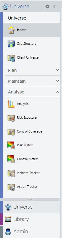
Note: The group headings for each navigation pane are customisable within Terminology.
Accessing navigation settings
Several navigation settings allow you to configure the appearance and behaviour to your preference. The settings persist to your local PC, maintaining the same appearance each time you use the system.
To access the settings menu:
- Click the cog icon in the top right of the navigation pane.
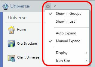
Choosing between grouped and list view
Items are shown in grouped mode by default.
If you prefer, you can revert to showing items in a flat list. This is useful for occasional users who may only have access to a few items in any pane.
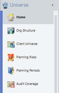
Configuring group expansion behaviour
This toggle affects how groups are expanded and is only enabled when items are shown in groups.
Auto Expand
This is the default mode of operation:
- Hover the mouse over a group and it will expand to show its items
- Select an item in a new group, any previous group will collapse and the new group will stay open
- Move away from a group without selecting an item, it will automatically close again
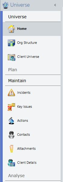
There are times when the Auto Expand behaviour is undesirable, for example on smaller screen sizes.
Manual Expand
If you want the ability to have more than one group open at a time, Manual Expand allows each group to be expanded or collapsed by clicking on it. A chevron is displayed next to all groups except the one containing the selected item (which cannot be collapsed).
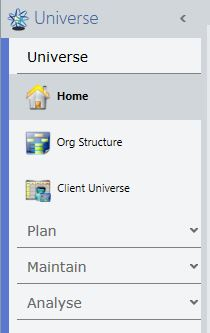
To expand or collapse groups manually:
- Click anywhere on the group header to expand or collapse that group.
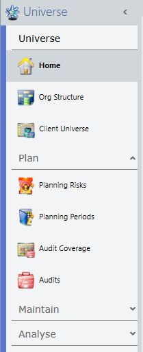
- Hold down Shift whilst expanding or collapsing a group to expand or collapse all available groups in the pane
- The expansion state of each group is persisted to your local PC, so you can expand your most commonly used groups and have them appear the same way the next time you use the system
Adjusting display options
This toggle affects how items are displayed.
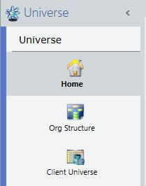
Icon Above Caption
The icon and caption are displayed in the traditional manner.
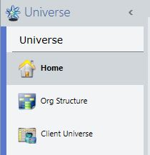
Icon Beside Caption
The icon is left aligned, with the caption to the right.
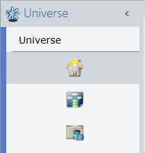
Icon Only
Just the icon is shown.
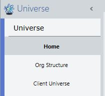
Caption Only
Just the caption is shown.
Setting icon size
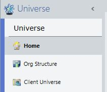
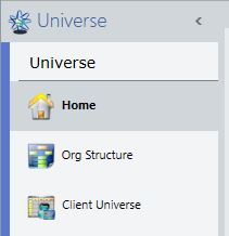
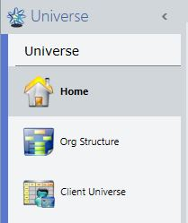
If shown, this toggle adjusts the size of the icon displayed, allowing you to make the most efficient use of space on screens of various sizes.
Small
The icons are shown at 16x16 to reduce space taken up on the screen.
Medium
The icons are shown at their traditional 26x26 size.
Large
The icons are shown in a large 36x36 size which look better on larger screens with high resolution.
Note: As you move around the system, the icons will update automatically to reflect the available functionality (Universe, Entity Work, Audit Work, Library and Administration).
Launching items in new tabs
You can have the same screen open in multiple tabs to quickly compare information across multiple screens or records.
To launch an item in a new tab:
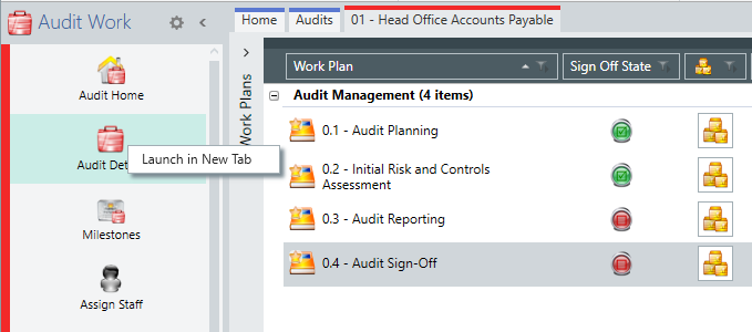
- Right click on any spine item.
- Select Launch in New Tab.