

New article
Recently updated
Using the data grid

Who is this article for?
Users who need help navigating the system.
No special access or permissions are required.
The data grid is the main screen display that shows database information in a tabular format with columns and rows.
Understanding the data grid
The main screen display is based on a grid (a set of columns with headings and rows of information). This tabular screen display provides a view of the data stored within the database and is called the Data Grid.
The selected Navigator/Spine item together with the display mode determines what information is displayed in the rows. The properties panel displays additional information about the currently selected row and is used to edit or enter data.
In the example below, the Objective Templates are displayed within the Risks, Controls and Tests Library.
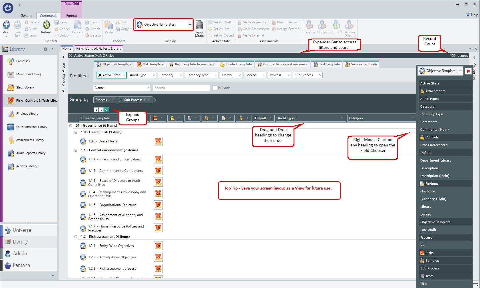
Data Grid
Each row on the data grid represents an item such as an audit, objective, risk, control, test, or finding. Each column heading displays information about the item, such as its reference, title, owner, and status.
The highlighted data grid row is a shade darker to make it clear which row is selected.
Amending records
To amend records:
- Select View from the Ribbon, or double-click on a row to open the Properties Panel.
Note: Permissions or the sign-off state of a record may result in property fields being set to read only.
Modifying the data grid
The data grids can be modified to:
- Expose or hide columns using the Data Grid Column Picker
- Re-order and resize columns
- Open the Expander Bar to use the pre-filters, sort, or group by area functions
- Use the Navigator to further refine and filter the results
To ensure the screen is not overwhelmed, the data grid has a maximum row height. You may change the width of a column to show all the data if required.

Understanding warning and limit values
You can restrict and warn how many records are returned to the data grid. The system has two values corresponding to a Warning and Limit level.
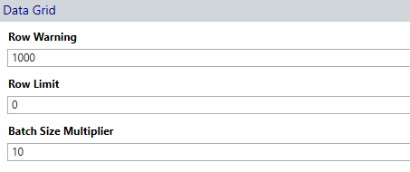
The user will be given a prompt when they exceed the row warning level: 'Do they wish to proceed?'
The system will prevent a user from exceeding the row limit value: 'use data grid filters to reduce the number of records returned.'
When the Row Warning value is set to zero, there is no warning provided to the user.
When the Row Limit value is set to zero, the system will return all records.
When Reporting Mode is on, the Limit value does not apply; however, the user will still be given the Row Warning.
Saving screen layouts with views
Views are the mechanism to save your screen layouts. This is an important feature and can be used to configure the screen for different purposes, such as reporting.
The data grid component has Expand To buttons to allow the Groups to be quickly expanded or collapsed. The current expansion value is also saved as part of the View, so will be restored next time that View is loaded.

Making multiple selections
Multiple selections can be made on any data grid, allowing simultaneous updates to their common properties.
A user can hold down the Shift key to do an 'extended' selection or hold down Ctrl to do an 'advanced' selection. In all cases, selected rows will be highlighted and implies to the user that any subsequent operations will perform over all highlighted (selected) rows.
Selecting a row block
To select a block of rows:
- Use the Shift key to select a block of rows between two selected records.
Selecting individual items
To select individual items:
- Hold down Ctrl.
- Individually click each item to be selected.
- To deselect a record, select Ctrl and click again on the row.

- Ctrl and Shift can be used to select multiple sections of the grid
- Commands that cannot be applied to multiple rows are greyed out in the ribbon
- Common properties that can be updated (ticking or checking) are typically shown in the properties panel (using the tick option, values can also be cleared)

Select Individual Items
This is also the same process whereby the user can make single or multiple selections in any tick box screen (add people, get from library, etc.).
Tick or check individual or multiple selections for inclusion, using the check box next to the row.
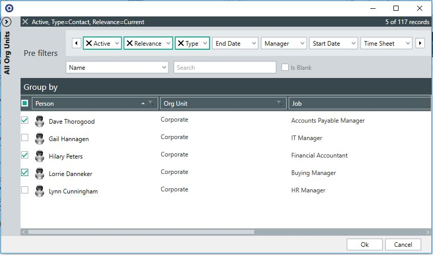
Select Multiple Items
Viewing related data
Where data from related items is available, a user may expand or collapse the data grid to display child items by clicking on the relevant icon.
For example, when viewing a list of work plans, the steps within each work plan are accessible as child items.
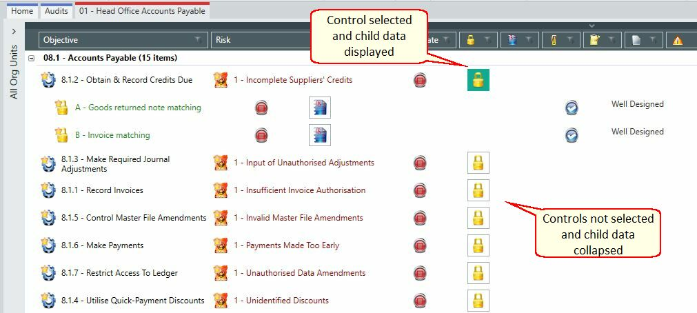
Related Data
- Shift and click expands all
- Shift and click collapses all
Using data grid column totalling
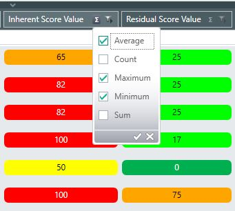
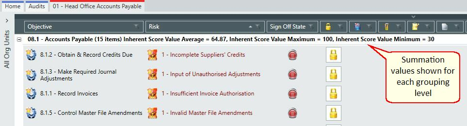
Using the Summation icon ∑, you can display on the data grid calculations for the:
Risk
- External Assessment Residual Score Value
- Internal Assessment Residual Score Value
- Inherent Score Value
- Risk Residual Score Value
Control
- Score Value
- External Assessment Score Value
These calculations allow you to analyse multiple score values including:
- Average
- Count
- Maximum
- Minimum
- Sum
Filtering data
When working with a large amount of content, it can be difficult to find information quickly. Pentana allows a user to narrow down the data by applying a filter (or many filters), allowing users to view only the information needed. Filtering doesn't modify the data that is retrieved, but filters the data in a way that the user wants.
Using the filter selection
To use the filter selection:
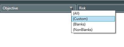
Click the filter arrow

that appears to the right of each column header.
The following options are shown:
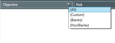
- All – shows all records with no filters applied
- Custom – the user can create their own custom filter to refine a subset of data
- Blanks – shows data where fields are not completed
- Non Blanks – shows data where all fields are completed
Using the custom filter selection
In Pentana, the Custom Filter Selection allows you to create your own filters based on your bespoke expressions.
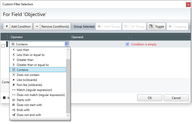
The following operators are available for selection:
- Equals
- Not Equals
- Less than
- Less than or equal to
- Greater than
- Greater than or equal to
- Contains
- Does not contain
- Like (wild cards)
- Not like (wild cards)
- Match (regular expressions)
- Does not match (regular expression)
- Starts with
- Ends with
- Does not end with
Adding a custom filter
To add a custom filter:
Click the filter arrow

that appears to the right of the column header.
- Click Custom from the drop-down menu.
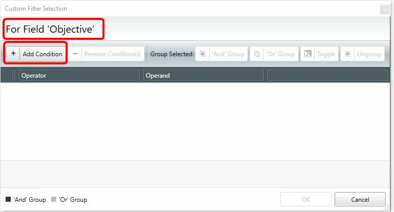
The Custom Filter Selection screen appears, showing the user what field the custom filter will be applied to (for example, Objective, as shown below).
- Select Add Condition from the menu.
- Select the operator from the drop-down menu (in this example, Contains).
- Enter an Operand.
- Click OK.
The data grid will be filtered.

Note: When hovering over the filter arrow
located to the right of the column header, the custom filter applied to that specific column is shown.

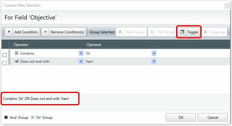
You may add multiple criteria and use the Toggle option to either select the And group or the OR group.
The following example selects all Objectives that contain the value 'Sit' or does not end with the value 'ham'.
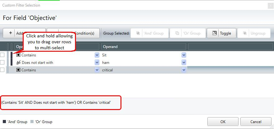
You may additionally have mixed operators.
To create mixed operators:
- Multi-select the rows you want to group (do not use the check boxes) by clicking and holding on the black bar between the check box and the operators.
- Drag down over the required rows.
Once highlighted, the Add and OR buttons become available.
Removing a condition
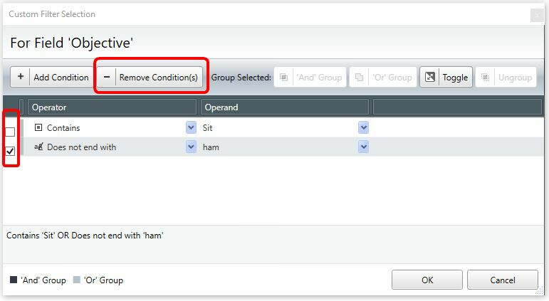
To remove a condition from the Custom Filter Selection window:
- Select the condition using the check box.
- Click the Remove Condition(s) button.
Note: Multiple conditions can be removed at once by selecting multiple check boxes.